Match Education
Recruitment Campaign
Scope of Project
- Campaign design
- Large-scale graphics
- Social media graphics
Print design
The Challenge
After seeing a decrease in application numbers, Match Charter School sought to create a multiligual campaign to bring attention to the important upcoming application date and increase applications and enrollment. Match Charter School also wanted to build brand awareness and differentiate from the many other charter schools in the area.
The Solution
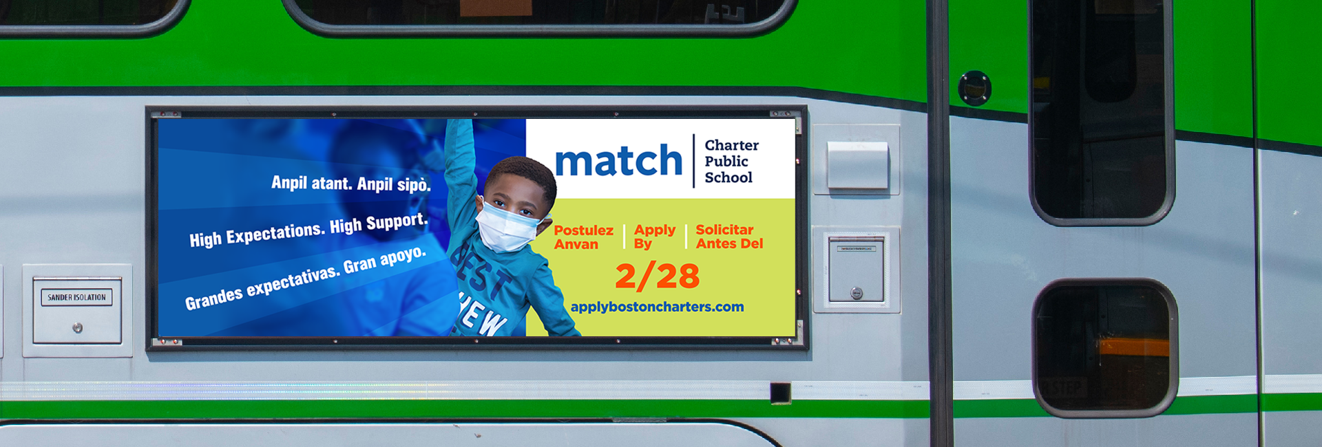
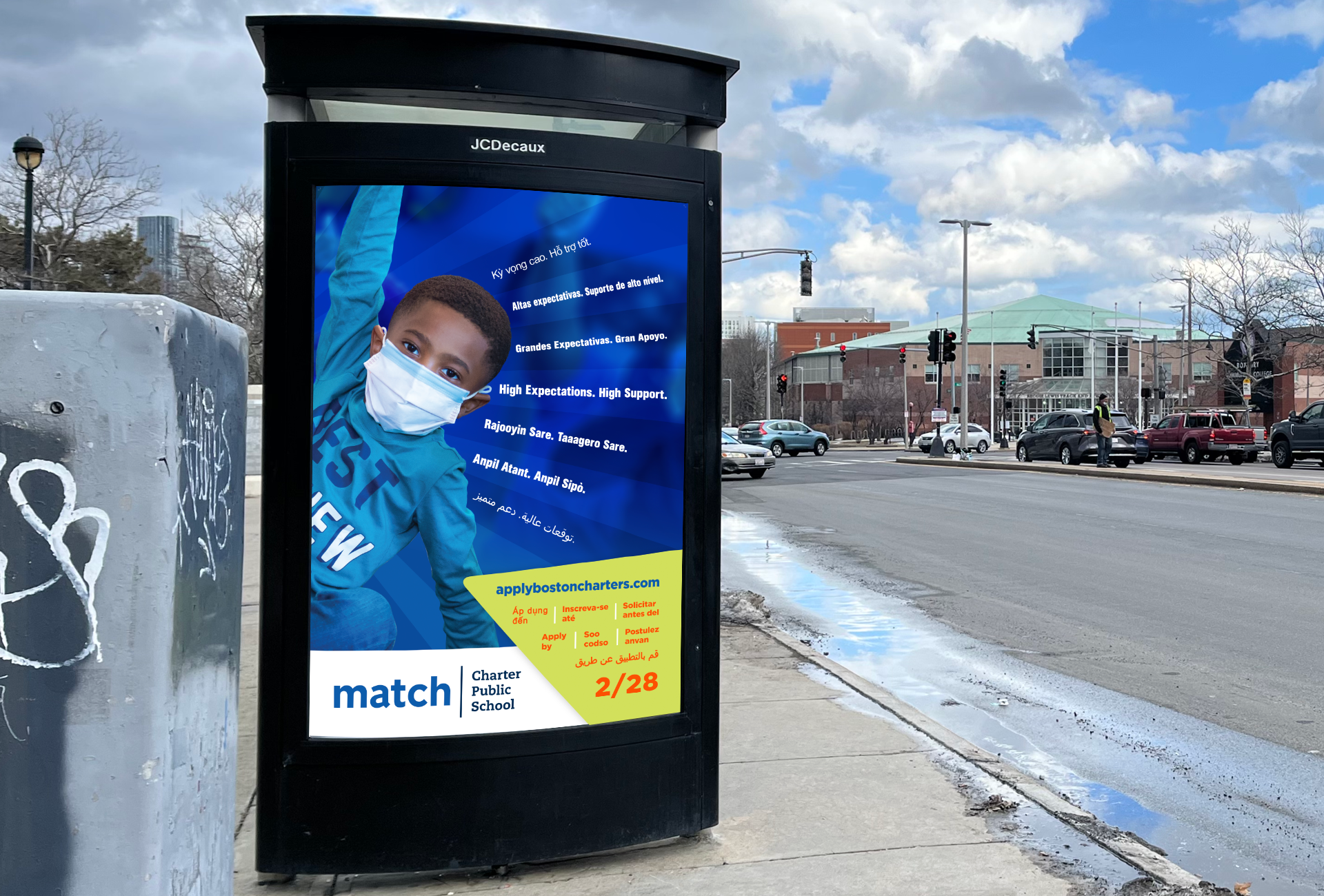
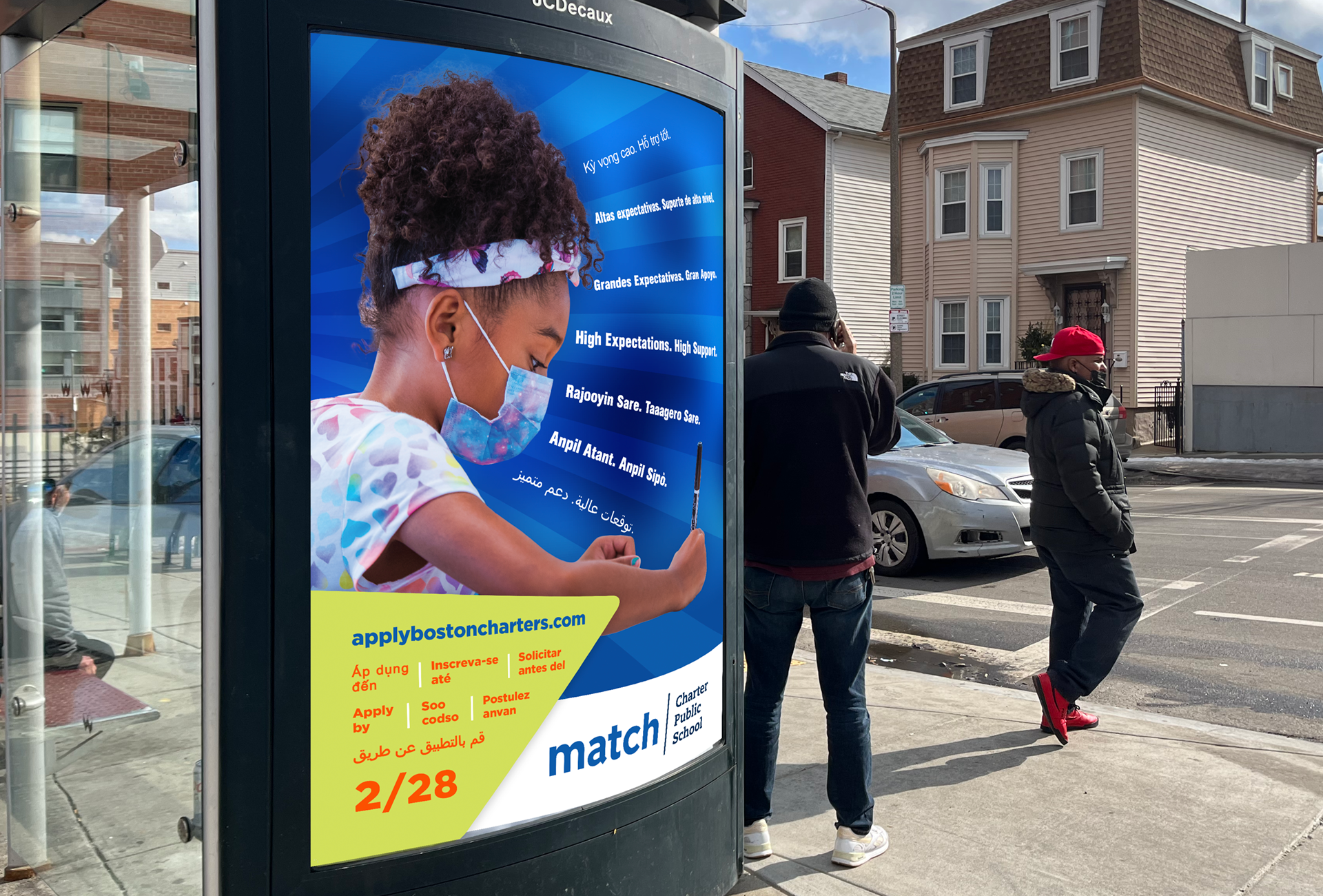
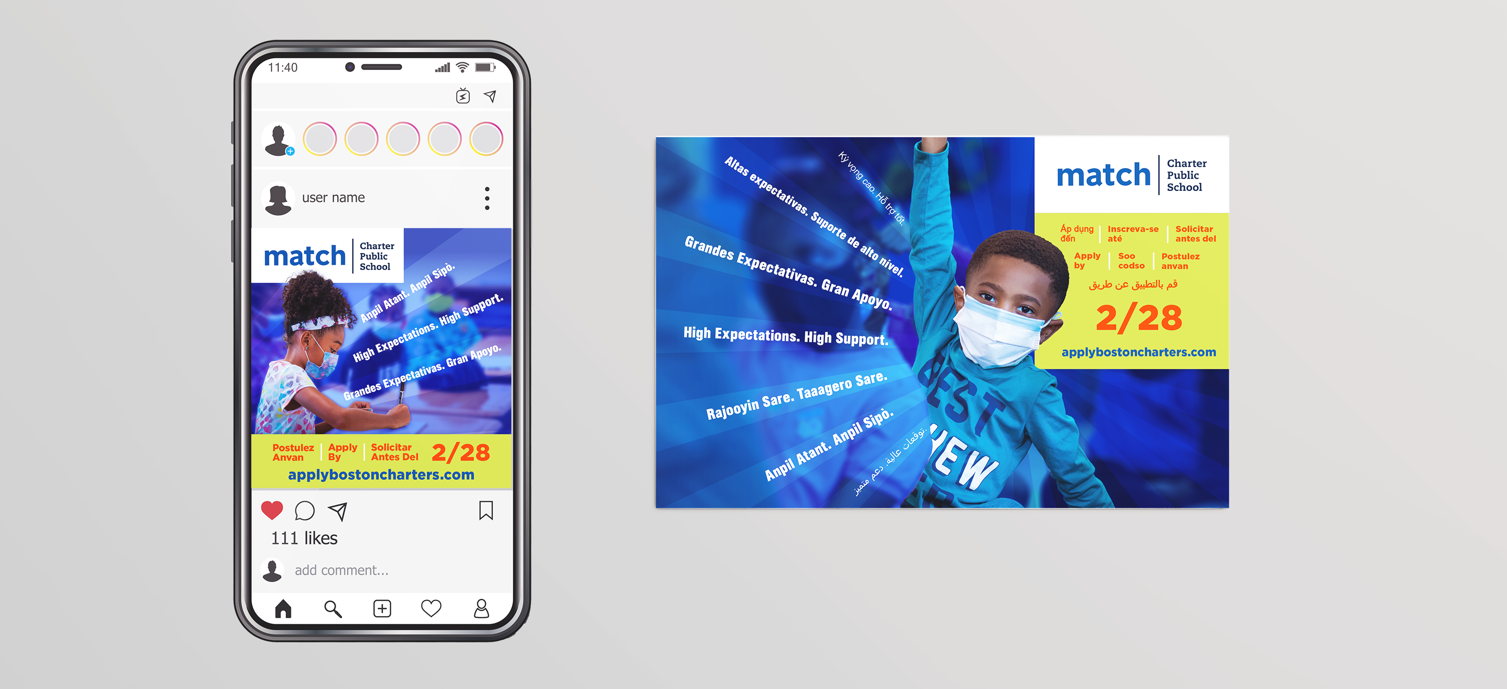
We worked within the Match brand and created an exciting and eye-catching multi-lingual campaign that included designs for MBTA signage, bus shelters, social media, and more. We ensured that the photography was down-to-earth and featured real students from Match to give a familiar and welcoming feel to the designs. We sought to show engagement in learning through the photography and a simple message that could communicate the application deadline quickly and clearly.
Designing a Multilingual Campaign
We helped coordinate photo shoots of Match Students in their learning environments and then designed an attention-grabbing campaign across bus shelter ads, print design, and social media graphics. We wanted to make sure the designs felt inspirational, simple, relatable, and could be quickly understood by busy commuters and parents throughout the City of Boston. Keeping copy concise helped us to be able to translate into seven of the most commonly spoken languages in the City of Boston.


The Ace Creative team is incredibly responsive and does a great job incorporating the many ideas and messages we want to convey in our recruitment materials and collateral.
